Tuesday, September 27, 2011

Adventures in Crafting: My Front Porch Purple Wreath Project

I've been on a purple kick lately and decided to use a purple leaf wreath as the centerpiece of my autumn porch decorations.  The only problem: I couldn't find an attractive option for purchase.  I obsessively searched local stores and the internet high and low; I put out calls on Etsy; no luck. And then, I found this, from the exquisite Twig & Thistle:


 via


Gorgeous.  Perfect.  But not for sale.

Lovely Shelli at a' la mode laughingly refers to herself as a DIFM ("do it for me") personality as opposed to a DIY-er.  I'm much the same way in that as highly as I value and respect self-sufficiency, I am craft-challenged.  Glue guns and I have a bad history; I get a headache just walking into a major craft store; I've never sewed anything except for buttons; glitter bewilders me; I can't even cut in a straight line.  And sometime I'll have to tell you about The Day I Cried while Covered in Paint at Home Depot.

My oldest daughter, however, is very artsy-craftsy. One of her major disappointments with me is that I'm not.  Since I don't like disappointing my daughter with my shortcomings, and because I felt an obsessive-compulsive need for a purple leaf wreath, I decided to try to replicate the Twig & Thistle beauty above.  After all, the original creator had helpfully provided directions; they seemed straightforward.  Off to the craft store I went.

Actually, it took me five different trips to three craft stores to find my supplies because I am as inept at craft-supply gathering as I am at actually crafting.  It was not an auspicious start.

I finally got my act together and followed Twig & Thistle's tutorial carefully, omitting the fabric flower simply because I couldn't find fabric in time.  My home-spun result:


It's not as precise as the original, but I'm satisfied.  The nice thing about the leaves being pinned instead of glued is that I can always adjust/amend later as my time and desire permit.  For now, I think the purple wreath is striking against the white door, and together with the adjoining urns filled with orange leaves and purple flowers, suggests Halloween festivity without resorting to overt garishness.  We'll add pumpkins and other trimmings later in October.


So concludes my first real attempt at DIY home decor.  I kinda liked the experience.  Next thing you know, I'll be telling my husband I need to convert his walk-in closet to a craft room....

Many thanks to Twig & Thistle for the inspiration.  In turn, I'll be sharing this post with Between Naps on the Porch, My Uncommon Slice of SuburbiaSavvy Southern StyleSaved by SuzySouthern Hospitality, The Frugal Girls, and Centsational Girl.

Has anyone else tried this project?  How'd you fare?

FYI: I used Montana Gold spray paint in Blue Velvet, Lavender, and Light Lilac.  I required almost 30 feet of 1.5 inch grosgrain ribbon and 36 fabric leaves to cover the wreath form. Although the original directions didn't prescribe, I painted both sides of the leaves.  I also used a finishing spray to help protect the wreath from the outdoor elements (which are not a major concern in my warm, arid, rain-free climate, but better safe than sorry) --- I have no idea if this will be effective, but if I don't update my post later with a story about purple paint running down my white door, then you can assume it worked fine. :)


October Reading List

My October reading list is a short, as September flew by without me finishing all of these.

Still, I plan to make time for...

a little fiction:


a little work-related non-fiction:


And a lot of eye candy.


What about you?  What's on your nightstand?

(Sharing with 5 Minutes for Books)

Sunday, September 25, 2011

Museum Day

Today was our town's annual Museum Day, on which dozens of fantastic museums open their doors without charging admission.  It's a great day for families to visit new-to-them museums as well as old favorites.  My husband and I had spent the early morning running a charity 5K, but as soon as we got home, we loaded up the kids and hit the cultural scene.

First, we strolled through the Umlauf Sculpture Garden, a beautiful urban forest filled with gifts of art.  When my oldest was a baby, we frequented Umlauf, but with three kids, visits have been rarer.  These are a few of my favorites pieces:

Mother and Child

another Mother and Child

The Family

And this is some of the scenery:


While there, the kids also got to make their own works of art from modeling clay.


(That's a pirate snowman standing on the mast of a pirate ship that's crashed into rocks, 
in case you were wondering.)

After Umlauf, we headed to the Bob Bullock Texas State History Museum, one of my daughter's favorite places.  The kids made water wheels and then watched Rumpelstiltskin, a puppet show presented by Literature Live.  We toured the galleries; the kids especially loved  the NASA exhibit.


Had my daughters not then started throwing tantrums over elevator-button-pressing-rights, our next stop would have been the Blanton Museum of Art, which we've visited several times before, and where even the atrium is an art installation.  This is "Stacked Waters," by Teresita Fernandez:


via 


Isn't it stunning?

The Blanton has beautiful, unique exhibits which enthrall all of our children.  Like this one:


It's by Cildo Meireles, called Missao/Missoes [How to Build Cathedrals], and consists of 600,000 coins connected to 2000 cattle bones by 800 communion wafers.  The piece references the connections between wealth, agricultural exploitation, and religion in seventeenth- and eighteenth-century Jesuit missions in South America.  It's a fascinating commentary for adults to contemplate, but from a toddler's perspective, it's really cool because the docents allow visitors to play with the coins. My children can sit here for hours, in a coppery glow, as they move the pennies around, stack them, try to count them...


My kids also really adore this film installation, called "Swimmer," which creates the illusion of a swimming pool on the museum floor.  A man backstrokes across the pool while staring straight at you; the sound of splashing water fills the gallery.  It feels so real that even adult visitors are tempted to dip their toes in the water.


The Blanton is a terrific museum for adults and children; we especially love their regular storytimes.

Our original plan also included a picnic at the Austin Museum of Art's Laguna Gloria, with its tranquil lakeside gardens.  During nicer weather, we often take our breakfast there on early weekend mornings because it's close to home and yet feels a world away.


 via

Alas, the Blanton and Laguna Gloria were not meant to be today; instead, we came home and had mandatory naptime...for the parents. ;-)  But we were glad we took advantage of some of our town's offerings today; it made us feel more connected to our community and appreciative of our cultural environment.  If you are ever in Austin, check out our museum scene; it's worth the time.

Thursday, September 22, 2011

Welcome to My Home: Formal Dining Room

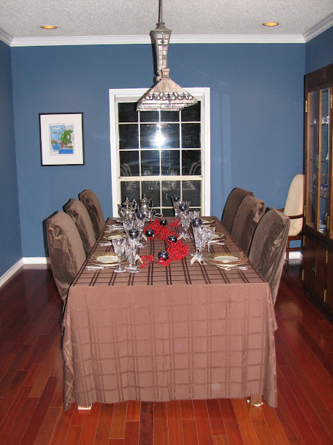
When we first bought this home six years ago, red dining rooms were all the rage on HGTV.  Designers encouraged making "a dramatic impact," and nothing was deemed more dramatic than red.  I like red, and I wanted a dramatic impact in my formal dining room, but I worried that red walls would get tiresome, and more importantly, clash with the reddish undertones of the hand-me-down mahogany dining table and china cabinet from my mom.

So instead of red, I chose blue.  A deep blue, somewhere between cobalt and navy, Martha Stewart's French Blue, to be exact.  I wanted our dining room to be an intimate space, one that encouraged long dinnertime conversations, one that felt different from the rest of the house, which is lighter and brighter.

Overall, I think I achieved that goal.  The French blue walls pop against the white moldings and plantation shutters; I further use the blue as accent in the wall art, china cabinet contents, and centerpieces. The Henredon mahogany burl china cabinet and table are past their prime but still meaningful to me given their family history, and the table seats 12 comfortably, which is a bonus. I covered the old chairs in cheapo chocolate brown covers from Bed, Bath, and Beyond to coordinate with the living room sofas; upgrading them is somewhere on my to-do list, but in the meantime, they work fine, especially given they are often used as fort-building materials by my daughters.


In addition to repainting the walls (which required removing wallpaper), we also installed Brazilian Cherry hardwood floors, recessed lighting, a new chandelier, and plantation shutters, and we removed the popcorn ceilings.

Here are two "in progress" pictures, taken after we re-did the floors and painted the walls, but before we removed the popcorn ceilings and added fresh lighting and the shutters.  Note that the old faux-Tiffany chandelier is reminiscent of those found in Pizza Hut restaurants, circa 1982.  Pretty horrid right?


Luckily, a family friend found a new home for the old light, and I found a new chandelier at Pottery Barn. I love the way it reflects light in both the living room mirror and the china cabinet.  When dimmed, it creates a lovely atmosphere for quiet dinners, sans kids.  Much better:


Once the major elements were in place, I adorned the walls with paintings, photography, and mixed media from local artists.  I live in an artsy town, and I thought this was a nice way to honor my cultural environment and provide some conversation starters.

This mixed media collage represents Austin, self-proclaimed "live music capital of the world":


These two photographs were taken of an iconic bridge down the street from me:


I took the top photo of a magnolia blossom on my old college campus; the bottom photo was gifted by a friend and depicts the church where I was married.


The beautiful photo of a boat's reflection in a New Zealand lake was taken by my talented step-dad; you can see more of his work here.  I like it because the blue water perfectly complements the wall color.  The painted collage on the adjoining wall was created by a local family friend; the scene is of the Charles River in Boston, which has special significance to my husband and me.


My favorite piece, by far, is this painting by Kathy Womack, from her Women and Wine series.  My husband gave me this painting as a "push present" upon the birth of our second daughter, who shares my red hair.  The picture somewhat wistfully reminds me of my big city days in my 20s, when I would occasionally wear pretty clothes and drink a lot of wine with good friends at fancy soirees.  By contrast, my life today includes a smaller city, much less wine, clothes that are practical rather than pretty, and few fancy soirees, unless you count the pretend-tea-party-with-your-daughters-kind.  ;-)


Next time around, I'll likely go for a very different look, something lighter and more modern.  That's the fun of growing up, moving on, and re-decorating.  But in the meantime, I am content with this room and its memories of many happy family holiday gatherings, birthday parties, baptism celebrations like these and these, election night parties, baby showers, and tea parties:


Our dining room is a happy place, and in every sense, adds brightness and color to our family life.  Is there a room in your home that does the same for you?


My dining room was featured by Involving Color:
InvolvingColor

and shared as part of:
Roomspiration

I'm also sharing this post with Savvy Southern StyleSaved by SuzyNo Minimalist HereFrench Country CottageThe Charm of HomeBetween Naps on the Porch and The Shabby Creek Cottage. If you are visiting the cul-de-sac for the first time, welcome, and please consider following!  Also feel free to check out other rooms in my "home tour" by clicking "Nest" in the navigation bar.