Wednesday, August 31, 2011
Relax
In the middle of another busy week, a visual reminder to slow down, relax, and breathe....
(Image courtesy of my parents' travel photo archives)
Sharing with Busy Working Mama, 5 Minutes for Mom, Live and Love...Out Loud, Project Alicia
Monday, August 29, 2011
Giveaway Winner!
Congratulations to #15: Denise on winning the $50 Sephora gift card! Denise, please contact me at theculdesacblog @ gmail.com within 48 hours to claim your prize. Thanks to everyone who entered and who is supporting my baby blog!
Friday, August 26, 2011
Thank you Remodelaholic for the Feature!
I'm honored and excited that my master bath makeover is being featured on Remodelaholic today. Check out the entire feature here.

Tuesday, August 23, 2011
September Reading List
My nightstand bookstack / iBooks library is a little sparse these days, thanks to my complete exhaustion from managing intense work obligations and the kiddos' crazy schedules. Sleep temporarily outranks reading!
But not completely, of course!
Here's my reading agenda for September:
As always, I welcome your recommendations.
(Sharing with my friends at 5 Minutes for Books)
But not completely, of course!
Here's my reading agenda for September:
Because after ten years, we still struggle for perspective.
Because I loved Little Children (the book) and Election (the film),
and I always appreciate dark satire of suburbia.
Because it's being touted as "Gatsby-esque," and I loved Gatsby.
Because NPR told me to read it, and NPR has yet to lead me astray. :)
As always, I welcome your recommendations.
(Sharing with my friends at 5 Minutes for Books)
Sunday, August 21, 2011
Welcome to My Home: Master Bath Makeover
One of the biggest projects we tackled in this house was our master bath. When we moved in, the master bathroom still boasted its 1984 decor: shiny peach floor tiles, three competing patterns of mauve/gray/peach/green/maroon wallpaper, popcorn ceilings, fluorescent lighting, an art-deco-style frosted glass window, two-toned faucets, cultured marble countertops, gray and teal painted cabinets, and a cave-like shower stall. Aside from the bathroom's overall spaciousness, it was a disaster, and these "before" pictures don't do the horrors justice:
It was so sad, wasn't it?
For budget reasons, we initially planned only a cosmetic update, but as luck would have it, a shower leak forced us to remodel completely. :-)
The renovation took much longer than expected because of contractor issues, but ultimately, we got (most of) what we wanted: a streamlined bathroom with a simple layout, luxurious finishes, modern amenities, and a warm, traditional style consistent with the house's architecture. We didn't over-personalize or do anything too trendy, because we know we'll upgrade from this home within the foreseeable future and wanted to maximize re-sale value. To that money-saving end, we left most of the plumbing and electrical in place.
So, welcome, to the improved master bath:

His-and-her-vanities flank the right and left ends of the bathroom and adjoin his-and-hers closets. We also have a full wall of extra-deep linen cabinets, which add the equivalent of extra closet space. All of the locally made custom cabinets are solid cherry and stained a dark espresso to complement our bedroom furniture. The cabinet knobs are from Restoration Hardware, as are all of the linens and accessories.

The countertops are Madura Gold granite; the floor is Italian travertine; the oil-rubbed bronze vanity faucets are from Delta; the wall paint color is Sherwin-Williams Netsuke. A combination of recessed, pin, directional, and ball lighting replaced the old fluorescents; the ceiling was lifted; an oil-rubbed-bronze ceiling fan helps keep things cool. And framed photographs of the ocean at Carmel and a river in Aspen are apropos for the water closet.
Much better now, right?
For more of my "home tour," please click on Nest in the navigation bar.
(Sharing with Metamorphosis Monday at Between Naps on the Porch)

(Also sharing with Homemaker on a Dime's Roomspiration, Savvy Southern Style, On Sutton Place, and The Shabby Creek Cottage)
For budget reasons, we initially planned only a cosmetic update, but as luck would have it, a shower leak forced us to remodel completely. :-)
The renovation took much longer than expected because of contractor issues, but ultimately, we got (most of) what we wanted: a streamlined bathroom with a simple layout, luxurious finishes, modern amenities, and a warm, traditional style consistent with the house's architecture. We didn't over-personalize or do anything too trendy, because we know we'll upgrade from this home within the foreseeable future and wanted to maximize re-sale value. To that money-saving end, we left most of the plumbing and electrical in place.
So, welcome, to the improved master bath:
We punted the 80s-style jetted tub that no one ever used in favor of a double shower with Turkish travertine, oil-rubbed bronze Grohe fixtures (including three shower sprays: traditional, rain, and handheld), and frameless glass. The window has rain glass to permit privacy while still allowing light. A long bench provides ample seating, and two niches house all of our toiletries. The shower now measures 6' x 6.5' and is the centerpiece of the room.

His-and-her-vanities flank the right and left ends of the bathroom and adjoin his-and-hers closets. We also have a full wall of extra-deep linen cabinets, which add the equivalent of extra closet space. All of the locally made custom cabinets are solid cherry and stained a dark espresso to complement our bedroom furniture. The cabinet knobs are from Restoration Hardware, as are all of the linens and accessories.

The countertops are Madura Gold granite; the floor is Italian travertine; the oil-rubbed bronze vanity faucets are from Delta; the wall paint color is Sherwin-Williams Netsuke. A combination of recessed, pin, directional, and ball lighting replaced the old fluorescents; the ceiling was lifted; an oil-rubbed-bronze ceiling fan helps keep things cool. And framed photographs of the ocean at Carmel and a river in Aspen are apropos for the water closet.
Much better now, right?
For more of my "home tour," please click on Nest in the navigation bar.
(Sharing with Metamorphosis Monday at Between Naps on the Porch)

(Also sharing with Homemaker on a Dime's Roomspiration, Savvy Southern Style, On Sutton Place, and The Shabby Creek Cottage)
It’s a Makeover! And a Giveaway!
Notice anything new? Thanks to the creative talents of Danielle Moss, the cul-de-sac got a much-needed makeover! The new look is way more “me,” and I so appreciate Danielle’s patience and skill. I encourage any of you who are looking for blog re-designs or pre-made templates to check out Danielle’s talents here. She’s lovely to work with! Thanks, Danielle!
In preparation for the new school year, I’ve been giving myself a mini-makeover, too. A few new clothes, a few more hours at the gym, a new hair cut, and a new bag of fresh make-up have made a world of difference in my attitude about going back to work post-baby #3. It feels really good to spend a little effort on me these days.
I also want to encourage those of you silent readers to come out of the woodwork and join the cul-de-sac conversation. I’m really valuing the connections I’ve already made via this blog and would like to get to know you, too! So in celebration of beautiful blog templates and beautiful friendships, I’m giving away a $50 gift card to Sephora, a one-stop shop for all-things beauty. Whether you are a perpetually sleep-deprived working mom with dark undereye circles like I am, or a polished, trend-setting fashionista like I’m not, Sephora offers something for you.
The gift card can be used online (with free shipping for $50 in purchases) or in one of their many U.S. stores. You must be at least 18 and a U.S. resident to enter.
The gift card can be used online (with free shipping for $50 in purchases) or in one of their many U.S. stores. You must be at least 18 and a U.S. resident to enter.
To enter: Follow the cul-de-sac via Google Friend Connect and leave a comment letting me know. If you are already following, leave a comment.
For additional chances to win:
1. Blog or tweet about this giveaway and leave a comment letting me know.
3. 2. Share the blog love and leave a comment about a great blog (other than your own) that I should be reading. :-)
In all cases, make sure your email address is in your profile so I can contact you should you win. Entries will close Sunday, August 28, at 8 pm Central, and random.org will choose the winner. Good luck!
Saturday, August 20, 2011
There must be a fly on my wall...
There must be a fly on my wall. How else to explain Amber Dusick's blog, which so perfectly illustrates much of my daily life? It's like Amber, the blog's author, sees everything that goes on in my home. I especially love her home tour:
As I've noted in my own "home tour" posts, real life doesn't look like a magazine!
Check out Amber's blog. It's the funniest thing I've read lately. And given that she's a 2011 Parents Funniest Mom Blog Nominee, I'm not the only one who finds her blog to be a breath of fresh air.
Happy Saturday!
As I've noted in my own "home tour" posts, real life doesn't look like a magazine!
Check out Amber's blog. It's the funniest thing I've read lately. And given that she's a 2011 Parents Funniest Mom Blog Nominee, I'm not the only one who finds her blog to be a breath of fresh air.
Happy Saturday!
Friday, August 19, 2011
Welcome to My Home: Nursery #2
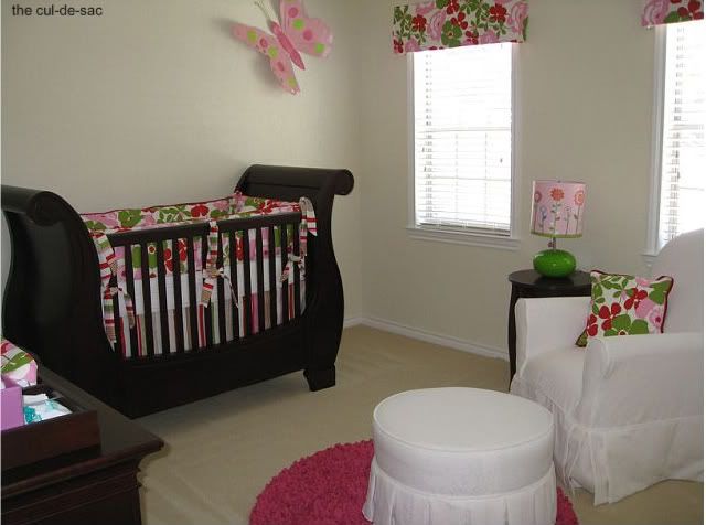
Three young children have meant three nursery designs. While the first nursery is the most elaborate and sentimental to me, and the third is still a work in progress, my current favorite is the second, for its simplicity, cheerfulness, and whimsy:
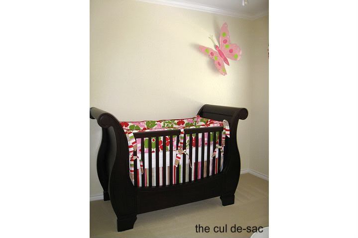
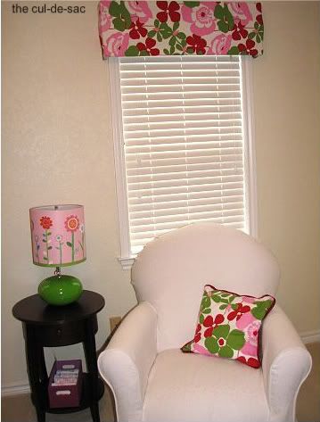
I juxtaposed the traditional sturdiness and elegant lines of PBK's Larkin Collection in espresso with a modern Alexander Henry fabric in pink, red, and apple green. I custom-ordered the crib bedding and changing table cover from Maddie Boo Bedding; I also ordered extra fabric, and my mom made the pillow and no-sew cornice boxes (with foolproof kits from Joann).

One of my favorite pieces in the room is the bright pink Shaggy Raggy Rug; the texture is perfect for play, or the impromptu floor nap.
Although I shun overt themes in room decor, we did use a butterfly motif throughout the room --- on the walls, with the mirrors, through a pillow, on the growth chart, on the lamp shade.
Other elements sprinkled throughout the room personalize the space and of course, add function, too.
Since taking these pictures, I've added some personalized artwork over the crib. Otherwise, the room is very simple, even minimalist in its decor. The overall feel is of lightness, brightness, and happiness. That sums up the room's occupant as well. :)
Sources:
PBK: Larkin Crib in espresso; Larkin Extra-Wide Dresser and Topper; Sleigh Table; butterfly mirrors; turtle pillow; baby book
Maddie Boo Bedding via Dolce Baby: Crib skirt and bumper; Changing Table Cover
Oopsy Daisy: Table lamp
Little Castle: Glider and ottoman in "serendipity snow" fabric
Shaggy Raggy Rugs via Baby Coco: pink rug
Salvage Style: Metal butterfly
Red Envelope: growth chart
Target: pink storage boxes
Ella Bella Photography: newborn portrait
(shared with a' la mode and Design Dazzle)
I juxtaposed the traditional sturdiness and elegant lines of PBK's Larkin Collection in espresso with a modern Alexander Henry fabric in pink, red, and apple green. I custom-ordered the crib bedding and changing table cover from Maddie Boo Bedding; I also ordered extra fabric, and my mom made the pillow and no-sew cornice boxes (with foolproof kits from Joann).

One of my favorite pieces in the room is the bright pink Shaggy Raggy Rug; the texture is perfect for play, or the impromptu floor nap.
Although I shun overt themes in room decor, we did use a butterfly motif throughout the room --- on the walls, with the mirrors, through a pillow, on the growth chart, on the lamp shade.
Other elements sprinkled throughout the room personalize the space and of course, add function, too.
Since taking these pictures, I've added some personalized artwork over the crib. Otherwise, the room is very simple, even minimalist in its decor. The overall feel is of lightness, brightness, and happiness. That sums up the room's occupant as well. :)
Sources:
PBK: Larkin Crib in espresso; Larkin Extra-Wide Dresser and Topper; Sleigh Table; butterfly mirrors; turtle pillow; baby book
Maddie Boo Bedding via Dolce Baby: Crib skirt and bumper; Changing Table Cover
Oopsy Daisy: Table lamp
Little Castle: Glider and ottoman in "serendipity snow" fabric
Shaggy Raggy Rugs via Baby Coco: pink rug
Salvage Style: Metal butterfly
Red Envelope: growth chart
Target: pink storage boxes
Ella Bella Photography: newborn portrait
(shared with a' la mode and Design Dazzle)


